
Cureka
Client
Overview
Cureka is a health symptom checker tool that allows anyone to check-up their symptoms by answering targeted questions to receive accurate diagnoses and get suggestions on steps to take. A tele-consult option is also available.
Responsibilities
Prototyping
User Research
Usability Testing
Iterating
Understanding Flow And Architecture That Works Best For Users
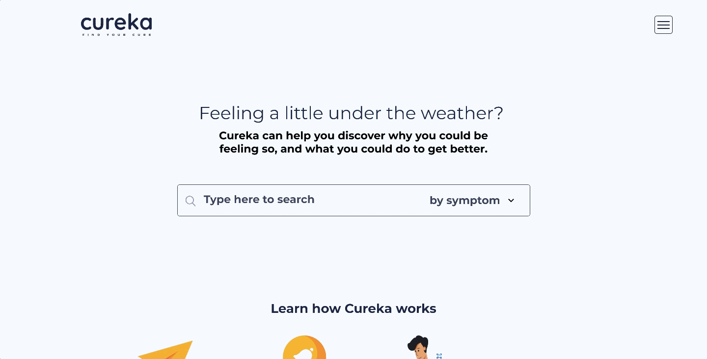
Cureka is a health-tech start-up making everyday healthcare accessible, particularly for middle- to low-income users who may struggle with rising medical costs in Singapore. Their platform helps people assess symptoms through guided questions and understand the severity of their condition before seeking treatment.
My team of four partnered with Cureka to enhance the usability of their symptom-checker — restructuring the content, simplifying the flows, and creating a more fluid, user-friendly experience.
Defining the Scope
Running on a 3-week timeline, my team and I narrowed down the scope by understanding the client’s specific needs. Then we proposed the best steps to take to efficiently utilise the project timeline before jumping into design exploration.

Problems To Solutions
They wanted their symptom checker to feel trustworthy, seamless, and supported by a community where users could ask questions and engage.

Our approach
Landscape scan – We analysed direct tools like WebMD and Mayo Clinic, and looked to community platforms such as Facebook and Reddit for trust-building cues. Telehealth platforms were also reviewed to identify patterns that worked.
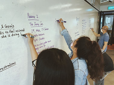
User conversations – We interviewed parents, students, caregivers, and doctors to understand how they seek care, use symptom-checkers, and where current tools fall short. Insights were clustered and synthesised to guide our redesign.
Investigate With Two UX Options
With the clustered insights, we developed two design directions with different content hierarchies and tested them with users across the key demographic segments defined with the client. This ensured our recommendations remained equitable and aligned with their target audience.
Landing Option 1

Landing Option 2

Landing Page Content & Hierarchy
We tested different ways of guiding users into the symptom-checker journey — comparing formats like an instructional video versus a step-by-step visual walkthrough.
This helped us understand which approach better educates users and builds trust at first touch.
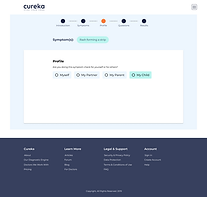
Questionnaire Methodology & Diagnostic Information Architecture
We explored two interaction models for the questionnaire: a conversational, chatbot-style flow versus a traditional multiple-choice format.
We also tested variations in the information architecture of the diagnosis page to assess which structure provided clearer, more reassuring results.
Chatbot Style

MCQ Style
Refine and Define
We merged the best-performing components from both concepts into a single, user-led direction. Every element was selected based on evidence, not preference — and we worked closely with the client to show why these choices created the clearest, most trustworthy experience.
Final Direction

Takeaways
This project was conducted in its early phases in 2020. With limited timeframe and resources, we managed to achieve quite extensively. Research results can be more comprehensive should there be a wider scope of subjects and sufficient budget. However, with the research we have made, it opened new perspective for user needs be it for patients or health professionals. These new perspective could potentially be used to innovate new components in the design of future iterations.