
SEConnect
Project
Overview
Key Responsibilities
The SEConnect (f.k.a. the Mood Reflection Platform - MRP) enables students to log their moods at various points throughout the school year. This tool provides educators, particularly class teachers and year heads, with insights into students' emotional well-being, allowing for proactive interventions and creating a supportive school environment.
I led the design of the staff interface, focusing on two core user groups:
-
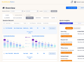
Class Teachers - Able to track individual student entries, compare emotional trends over specific periods, and identify students in need of immediate support.
-
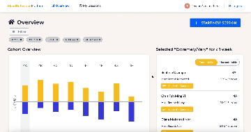
Year Heads - Offered a broader view, with the ability to analyze the entire cohort’s emotional trends and compare data across different periods and classes.
UX & Interface Design
Developing user-friendly interface tailored to class teachers and year heads.
Cohort Mood Analysis
Designing tools for tracking and analyzing trends over time to provide meaningful insights.
Language & Color Psyhcology
Implementing positive language and color schemes to ensure a supportive user experience.
Quick Insight Widget Development
Crafting widgets that summarize trends and highlight high-frequency entries.
Iterative User-Centered Design
Refining features based on UT feedback to improve usability and effectiveness.
The Design Process
Understanding User Needs
-
Worked with experienced teachers and year heads to understand how they currently monitor students' well-being and identify gaps in the process.
-
Defined core use cases: quick cohort analysis, individual student insights, and comparative trend analysis across different periods.
-
Ensured that the platform’s functionality addressed both immediate and long-term needs.
Flow & Architecture Development
-
Explored different architecture options to ensure an intuitive flow for users.
-
Built two distinct UX options, each tested to determine which layout best met the teachers' and year heads' needs.

Designing for Psychological Impact
-
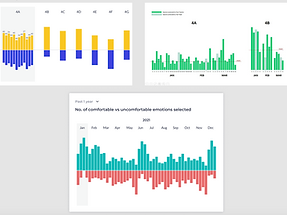
Positive Language: Replaced terms like "negative" and "positive" with "comfortable" and "uncomfortable" to minimize bias and judgment, aligning with psychological principles that reinforce neutrality and reduce stigma.
-
Color Theory:
-
Blue for Discomfort: Chose blue over red to denote discomfort, as blue is perceived as calming and non-threatening, reducing anxiety and preventing unintended negative reinforcement.
-
Yellow for Comfort: Used yellow to represent comfort, as it evokes warmth and positivity, subtly promoting a sense of safety and encouragement.
-
Adjusted the hues to indicate intensity levels of emotion without causing confusion, improving clarity for quick analysis.
-
Iterative Refinement
-
Refined visual elements like bar charts to improve clarity, ensuring quick identification of emotional trends.
-
Adjusted features based on feedback to enhance usability and relevance.
-
Conducted several rounds of user testing with teachers and year heads to ensure that the interface effectively met their needs.

Final Implementations & Insights
-
Successfully developed a final design that allows educators to efficiently track, compare, and respond to emotional trends.
-
Facilitated a more empathetic approach to student well-being, contributing to a healthier school environment.
-
Improved educators' ability to identify and address student well-being, with quicker response times to support students experiencing discomfort.
-
Enhanced user satisfaction, as indicated by positive feedback on the platform's usability and effectiveness.
-
Reinforced a culture of empathy and proactive support within the school, making it easier for educators to manage mental well-being holistically.
Key Takeaways
-
Designing for education requires balancing data-driven insights with a supportive, empathetic user experience.
-
Language and color choices play a crucial role in user psychology, influencing how users perceive and interact with the platform.
-
Regular user feedback is essential in iterating towards a solution that genuinely meets user needs.