top of page

SDIS (Student Development Integration System) is a school camp booking platform built on Salesforce, designed to support multiple national programmes under MOE.
We started with the Outdoor Adventure Learning Camp (OALC). Our goal was to streamline complex booking workflows across different booking phases and ensure schools could access camp slots clearly, consistently, and without confusion.

PROJECT TYPE
Desktop App
Product Design
TIMELINE
Mar - Jul 2025 (OALC)
Jul - Oct 2025 (SYF)
UX Research
TOOLS
Figma
JIRA
Salesforce Lightning Design System (SLDS)
Context & Starting Point
SDIS (Student Development Integration System) is a booking platform built on Salesforce to help MOE officers and schools manage national-level schools activity and event bookings.
Our journey began with the Outdoor Adventure Learning Camp (OALC), where we worked closely with OALC Programme Managers (OPMs) to identify the booking flow, pain points, and real-world constraints on the ground.
We mapped:
-
How OPMs manage calendars
-
How schools request slots
-
Capacity planning rules
-
Multi-school coordination
-
Yearly booking cycles
-
Edge cases and exceptions
This foundation allowed us to design a system that could later scale to National School Games (NSG) and Singapore Youth Festival (SYF).
Booking Cycles We Had to Design For
We discovered that schools don’t just “book camps”—they follow three distinct booking phases, each with unique rules and behaviours:
PRELIMINARY PHASE
For lower primary self-run and combined schools (small cohorts pairing up to run camps together).
MAIN REGISTRATION PHASE
For the national booking period for primary + secondary schools.
OPEN/POST BOOKING PHASE
For all schools including JC/IP, and for schools that missed earlier windows.
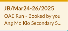
Each phase required different eligibility rules, colours, metadata, and card structures in the calendar.
These differences heavily shaped the final design.
Design Challenge — The Calendar
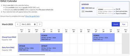
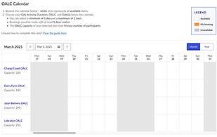
The heart of SDIS was the GoMeddo calendar on Salesforce — powerful but rigid.
We had to design a visual system that could:
-
show multiple booking phases clearly
-
represent different slot types using colour logic
-
display the right details on each card (capacity, school, status, phase)
-
avoid visual clutter despite complexity
-
work within Salesforce’s constraints
-
support administrators AND teachers
-
scale to national usage


This required very intentional decisions about information hierarchy, metadata, and colour mapping.
Design Process
SLDS FOUNDATIONS
We curated a focused subset of the Salesforce Lightning Design System (SLDS) — colours, typography, forms — to ensure consistency and feasibility.


COLLABORATIVE WORKFLOWS
We worked in 8-week sprints, managed via JIRA:
-
I helped structure tickets and prioritise tasks
-
daily stand-ups with the team
-
bi-weekly stakeholder reviews
-
one OPM stakeholder joined stand-ups to stay aligned with progress and constraints
VISUAL IDENTITY
The SDIS logo was designed to reflect the platform’s core purpose: connecting multiple booking systems into one unified experience for schools. Since the essence of the product is connection, I drew inspiration from the Wi-Fi symbol as a visual metaphor for network, access, and seamless linkage.

The logo blends meaning with simplicity: the quadrant shapes form an S, while the orange Wi-Fi arcs double as the dot of the “i”, symbolising connection. The two blue quadrants hint at a D, completing the acronym in a compact mark. The colours—cornflower blue (sports), lilac (music), and orange (adventure)—represent the range of student development programmes the system supports.
ITERATIVE DESIGN & TESTING
We refined card designs, modal flows, and colour logic through multiple rounds of feedback with OPMs and internal DBAs, balancing user needs and platform limitations.

➜

➜

➜

➜

System Architecture & UX Logic
To design SDIS on Salesforce + GoMeddo, we needed a structure that could translate real-world booking rules into an interface that was simple, clear, and consistent across all school types.
Here’s the architecture that powered the system:
BOOKING PHASE LOGIC ➜ CALENDAR BEHAVIOUR
We mapped each booking phase to specific UI behaviours so the calendar always reflects the correct rules:
Lower Primary self-run camps

Preliminary Phase
Combined schools camp
Main Registration Phase

Open Booking Phase

Post Booking Phase
School Users
Centre Managers

➜ This ensured schools always see the right slots at the right time, without confusion.
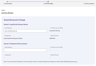
CARD METADATA HIERARCHY
Each GoMeddo card had to communicate a lot of information at a glance.
We defined a strict hierarchy:

➜ This reduced cognitive load and made high-stakes decisions clearer for schools.
UNDERSTANDING REAL-WORLD OPERATIONAL LOGIC IS KEY
Designing for OPMs and schools taught me how critical it is to map actual booking behaviours before touching UI.
DESIGNING WITH CONSTRAINTS REQUIRES DISCIPLINE
Working within Salesforce + GoMeddo pushed me to be intentional about hierarchy, clarity, and SLDS-compatible decisions.
SMALL DESIGN DECISIONS COMPOUND SIGNIFICANTLY
Colour logic, metadata placement, and card structure became pivotal for reducing confusion across thousands of users.
ITERATION BUILDS ALIGNMENT
Stakeholders initially preferred many colours to represent every variation. Through cycles of iteration and co-designing their processes, we clarified what truly mattered, allowing the colour system to be simplified without losing meaning.
bottom of page